


 nueva página del texto (beta)
 Inglés (pdf)
 Artículo en XML
 Referencias del artículo
 Enviar artículo por email
 Citado por SciELO
  Similares en
SciELO
Similares en
SciELO 
 Permalink
1 Introduction
Data is considered a resource in today’s world. According to the World Economic Forum, by 2025, we will generate around 463 exabytes of data globally per day [1].
Data analytics is a process of data cleansing, transformation, and modeling to uncover valuable insights for business decision-making. [2]. There are several types of data analysis techniques that are based on business and technology. However, the main types of data analysis are: Text analysis, Statistic analysis, Diagnostic analysis, Predictive analysis, and Prescriptive analysis.
Much of the data generated is about the health field. Public and private institutions are interested in storing and analyzing this information for diverse reasons; clear and timely diagnosis, designing and developing public health politics or creating marketing campaigns for treatments or medications. The necessary information for this analysis can come from diverse sources and have different characteristics. Hence, the implementation of Data Analytic techniques is required to normalize and study the obtained registers.
In the last years, the collection and analysis of data about the high rate of mortality diseases have been a challenge for governments and the pharmaceutical industry in the world. For example, cancer is the second cause of death worldwide. In 2018, 9.6 million deaths worldwide were due to cancer; one in six deaths was cancer.
The countries with low and middle income have a more number of deaths from cancer. In 2014 Mexico registered a mortality of 71,900 people for causes associated with cancer; in 2017, this number grew to 904 581, and it is estimated that it will reach 1,262,861 in the next decade [3].
Public and private organizations offer diagnosis and treatment of cancer in Mexico. However, no government institution carries out a registry of cases of cancer.
In Mexico, does not exist system for the control and monitoring of patients with cancer. This fracture in the national health system means that statistical data on cancer is spread over different sources. The records that do exist may be old, noisy, inconsistent, and sometimes incomplete data.
The process of data preparation is the foundation for practical analysis. Data preparation is not fully automatic, and it is estimated that it consumes 60% to 80% of the time in a data mining project [4]. This procedure includes integrating data collected from various sources, which must be cleaned for subsequent selection, analysis, and transformation.
Integrating high-quality cancer data is essential to help implement public health policies for preventing and treating this disease in Mexico. This paper proposes implementing data science techniques to obtain, analyze, classify and organize data from different public repositories about cancer in Mexico. In addition to a consultation web interface, where the study’s results mentioned above will unfold. The platform makes it possible to fully visualize the impact of this disease in Mexico by observing the incidence and mortality of this disease in the national territory.
When data from multiple sources, such as government systems, must be integrated, they are usually developed, implemented, and maintained independently to meet specific needs [5]. Consequently, data cleansing becomes a complex, extensive, and specific task. It is challenging to automate because each source can contain dirty data and be represented differently, overlap, or contradict each other.
Data visualization consist in drawing graphic to show data. Can use different kinds of tools like scatterplots, histograms, or heat maps. The objective of these displays is mainly descriptive, concentrating on simple summaries. Data visualization is useful for data cleaning, exploring data structure, detecting outliers and unusual groups, identifying trends and clusters, spotting local patterns, evaluating modeling output, and presenting results. The main goal is to visualize data and statistics, interpreting the displays to gain information [14].
2 Data Integration and Visualization in Health
Considering the large amount of data generated nowadays, the diversity of sources, and the characteristics of the information obtained, implementing tools that allow the concentration and visualization of data are necessary.
Specifically, about health data, there are some proposals made for the integration and visualization of information. The objective o these works are to facilitate the collection and observation of the data using computational applications.
2.1 Data Integration for Health
The work proposed by Rahi et al. [6] shows the relevance of data unification with different sources. They conjoined data about Malaria coming from public sector agencies, private healthcare providers, defense forces, railways, industry, and independent researchers. They suggest the creation of an integrated digital platform. The platform will provide real-time epidemiological, entomological, and commodity surveillance data that will be of immediate use to all stakeholders and allow the transparent and evidence-based formulation of malaria control policies [6].
Data analysis will facilitate the identification of potential hotspots of malaria and impending outbreaks. The system contains a set of alerts to inform the activities of monitoring and evaluation. The local or remote databases can be selected, guaranteeing continuous reporting. Considering new vision techniques, we seek to create regarding Cancer in Mexico a work similar to that carried out with malaria by Rahi et al.
As part of German Medical Informatics Initiative, Prasser describes the work made for the consortium Data Integration for Future Medicine (DIFUTURE) will establish Data Integration Centers (DICs) at university medical centers [7].
The DIFUTURE Data Integration Centers will implement a three-step process for integrating, harmonizing, and sharing data as well as images from clinical and research environments: First, Data is imported and harmonized using common data and interface standards using IHE profiles, DICOM and HL7 FHIR. Second, data is pre-processed and enriched within a staging and working environment. Third, data is imported into common analytic platforms and data models (including i2b2 and tranSMART) and made accessible in a form compliant with the interoperability requirements defined on the national level.
Same as other research demonstrated the relevance of data integration and visualization considering the future necessities of medical institutions for research and at the point of care as a basis for targeted diagnosis and therapy.
Another project analyzes the problems in collecting medical records to achieve a unified picture of the progression of cancer disease in Greece [8], Varlamis et al. use the death records for cancer cases collected by the Cancer Registry of Crete (CRC) which is member of the European Cancer Registry (ECR).
This institution collects data from private and public hospitals, for six years, between 1998 and 2004. Data like age, sex, place of birth, residence, occupation, and type of cancer diagnosed in Lasithi and Rethymno counties are available.
Feature selection was applied to assess the contribution of each collected feature in predicting patient survival. Several classifiers were trained and evaluated for their ability to predict patient survival. Finally, a statistical analysis of the two regions’ cancer morbidity and mortality rates was performed to validate the initial findings.
The data collected was entered into MSExcel and subsequently imported into SPSS and Weka, where the analysis was performed. The data integration phase was more accessible in this project since having a single unified registry provided by the European registry and efforts focused on pre-processing, completing incomplete records, removing duplicate records, and exploratory analysis of the same data.
The analysis of the data was divided into two areas; using the SPSS tool; an exploratory statistical analysis was carried out to achieve a greater understanding of the composition of the data set; after achieving the objective of the exploratory part, it was realized to the specific analysis, using WEKA. The objective of the analysis process in this project is to achieve a classification model to predict the possibility of cancer survival based on the characteristics with which the dataset was built.
2.2 Data Visualization for Health Data Management
The large amount of clinical data generated in medical practice can create complications for health specialists and experts in implementing public policies that try to understand the health status of patients or vulnerable groups. Different approaches have been adopted to solve the problem of data visualization using computational tools. However, many approaches must be considered. Some of the efforts made by specialists to implement practices in designing and evaluating visualization techniques for clinical data are shown below.
As you can see in ”Data Visualization for Chronic Neurological and Mental Health Condition Self-management: Systematic Review of User Perspectives” Polhemus et al. [9] also describe the necessity of visualization of data for users with special characteristics. For this project, the author collects data from mobile health devices and apps. The main idea is to obtain information of users living with chronic neurological and mental health conditions through data visualizations derived from Remote measurement technologies to manage health.
In this review, they search peer-reviewed literature and conference proceedings (PubMed, IEEEXplore, EMBASE, Web of Science, Association for Computing Machinery Computer-Human Interface proceedings, and the Cochrane Library) for original papers published between January 2007 and September 2021 that reported perspectives on data visualization of people living with chronic neurological and mental health conditions.
The articles were examined by two reviewers who screened each paper based on the abstract and full-text article. The extracted data underwent thematic synthesis.
They identified 35 publications from 31 studies representing 12 conditions. Coded data coalesced into 3 themes: desire for data visualization, impact of visualizations on condition management, and visualization design considerations.
The authors can conclude ”When used effectively, data visualizations are valuable, engaging components of RMT. They can provide structure and insight, allowing individuals to manage their own health more effectively. However, visualizations are not “one-size-fits-all”.
In ”Clinical Data Visualization: The Current State and Future Needs”, the authors use the taxonomy proposed by Starren and Johnson to classify the presentation of clinical data [10]. A graphical user interfaces analysis system is proposed in which each interface element is considered an object that can be classified as a list, a table, a generated text, an icon, or a graphic.
The document performs an analysis of the visualization of clinical data from different specialties. The first case analyzes the visualization of cardiac indole data, Blike et al. developed a setup graph to display cardiac parameters, which uses two multi-axis graphs to create geometric objects [11, 12]. These objects were designed to have properties that make it easier to differentiate shock states.
Physicians evaluated physiological data in a computer-based simulation in two separate studies. Using the configuration graph in conjunction with a traditional display improved accuracy and reduced time to diagnose crash conditions compared to the traditional display alone.
In the second example Pulmonary data can be observed, extracting information related to the pulmonary system through the ventilator. Interpreting ventilator data in conjunction with blood gas data allow assessment of a patient’s condition and monitoring of disease processes such as pneumonia and acute respiratory distress syndrome. Integrated lung screens have been developed as an alternative to manual review of individual respiratory parameters.
In 2019 Jiang et al. [13] present a health data visualization system emphasizing geospatial and temporal information integration in healthcare data and focusing on two methods developed specifically for public health data: Spatial Textures and Spiral Theme Plot. The spatial texture technique is used in geospatial visualization that inherently provides additional screen real estate (surface areas) that can be used to encode other data and attributes.
The Spiral Theme Plot technique combines several information visualization methods, including Theme River, Spiral Plot, and Scatter Plot. This combination of public health data with large patient databases satisfies several critical requirements for visualizing time-variant patient records.
Specifically, in the field of public health, the collection and analysis of data from various sources allow for statistical and predictive analyzes that would otherwise be partial or incomplete. Many works are carried out around this topic, focused on different health specialties and with different approaches. Specialists in Mexico require timely and transparent information for decision-making, so systems like the one proposed in this work become necessary.
3 Data Management of Cancer in Mexico
Cancer is a process of uncontrolled growth and spread of cells and can appear practically anywhere in the body, forming a tumor.
Not only prevention and early detection are essential to reduce cancer mortality figures, but also the distribution of resources by location and type of cancer for timely treatment. In this sense, it is important to have an integrated data set to query, analyze, classify, and predict the evolution of cancer in Mexico.
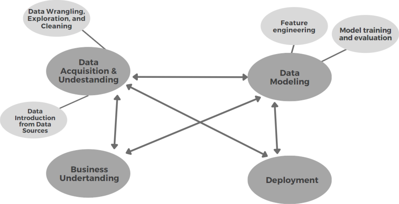
We adapt the Data Science Lifecycle of Team Data Science Process (TDSP) to this project as you can see in Figure 1; it includes business understanding, deployment, modeling, and data acquisition and understanding.. In the last one, there is the main contribution of this work because it integrates and cleans the data set.
The objective is to lay the foundations and generate a unification of the data sets for future regressions, classifications, groupings, anomaly detection, or recommendations.
3.1 Data Acquisition and Understanding
For the integration process is necessary to have a Data Introduction and a Data Exploration. The first one is to understand where the data came from and its destination for analysis, in this sense we analyze three primary data source platforms: INEGI, Datos Abiertos, and Infocancer. The second one was performed to clean the data, in this sense we normalize data formats, identify missing information, and merged data sets. Those two phases are explained in the next sections.
3.1.1 Data Introduction
Health care is a multidimensional system established for the prevention, diagnosis, and treatment of health-related problems or deficiencies in human beings. In Mexico, there are several health institutions that follow up on Cancer. Some of the data is available through online platforms, in this sense we analyze the content of four of those platforms as Data Sources: INEGI, Datos Abiertos, and Infocancer. ´
The National Institute of Geography and Statistic (INEGI - Instituto Nacional de Estadística y Geografía) is the main organism in charge of collecting and disseminating of information in Mexico. From this source, we, initially, collected different data sets related to deaths from 2012 to 2019.
Infocancer is a project of the National Institute of Cancer ( INCan - Instituto Nacional de Cancerología), from this source we collected statistics related to hospital admissions and mortality from 2007 to 2019.
Open Data (Datos Abiertos) is a public platform from de Federal Government to publish data, from this platform we used data collected by CNEGSR (Centro Nacional de Equidad de Género y Salud Reproductiva), IMSS (Instituto Mexicano del Seguro Social), CENSIA (Centro Nacional para la Salud de la Infancia y la Adolescencia), Goverment of Puebla State, INSP (Instituto Nacional de Salud Pública), HJM (Hospital Juárez de Míxico), INCAN (Instituto Nacional de Cancerología), Goverment of Jalisco, and Secretaría de Salud.
Table 1 shows the collected datasets with their description of the kind of that they have. It is important to know where the cancer cases are, when did they happen, and what type of Cancer is presented as diagnostics.
Table 1 Initial collection of datasets with their description
| Data Source | Kind of data | Diagnostic | Dates | Geographic component | Reg. Num. |
| INEGI | Mortality | Yes | 2012-2019 | Yes | 3301806 |
| Infocancer | Hospital Admissions | Some | 2007-2019 | Yes | None |
| CNEGSR (SICAM) | Statistics | Some | 2010-2019 | Yes | 1433 |
| IMSS | Hospital discharges | Yes | 2010-2019 | Yes (Delegations) | 360 |
| CENSIA | Children and youth | Yes | 2010-2019 | Yes | 991 |
| INSP | Nutrition of INSANUT | Some | 1994, 2006, 2000 | Yes | 100 |
| HJM | Laparoscopic surgery | Cancer | 2017 | Yes | 99 |
| INCAN | Admissions and Mortality | Yes | 2010-2019 | No | 2812 and 4013 |
We can see that the data sets of INEGI have a big amount of data, with the proper data cleaning, it will be useful for finding tends; on the other hand, Infocancer provides statistics reports that are useful as reference but do not for data mining.
From this initial collection, we got 27 files with 3311614 records.
3.1.2 Harmonized Data Model
Data harmonization refers to combining data from different sources minimizing redundant or conflicting data.
For data merging, three axes were considered on which the data would be combined, so that the records to be considered should have a temporal identifier, a geographic identifier, and a diagnosis.
It is also considered that data display will require elements related to age groups, types of cancer, state of origin of the patient or death, and year of registration. In this sense, the final data set uses two main sources: INEGI and IMSS for a period of 10 years, from 2010 to 2019.
The year 2020 was an atypical year because of the pandemic, so it was no considered. The collection from the first source was extended to have a data frame with 6557201 records with 59 characteristics related to mortality. The collection of the second data source was also expanded up with 43 characteristics related to hospital discharges with a total of 23 files with 6782130 records.
In both cases, the cause of death and the final diagnosis is a good discrimination point for the data, as we can identify only cancer-related fields. We used the international standard with the ICD-10 codes. There are 452 keys to specific cancer diagnostic.
Under the advice of a medical team, the types of cancer that can cover various conditions were selected, reducing this list from 452 specific diagnoses to 36 generic diagnoses. A dictionary was then constructed to identify to which generic cancer type each specific diagnosis belongs. This reduction was significant as it is more manageable for medical personnel.
Figure 2 shows the mapping of the specific diagnostics (Fig. 2a) provided by the original source to a corresponding ICD-10 code (Fig. 2b), where the cause column represents the diagnostics. For example, 17 different malignant tumors located in the external and internal parts of the mouth such as lips and tongue correspond to a single generic key C14 corresponding to Oral Cavity and Pharynx Cancer. This mapping was performed with the support of physicians with various specialties.

For the geographic component, we mapped the data into official geographic keys related to states and municipalities. There are 2475 municipalities. For this cleaning, null data was eliminated and a staggered patron for states and municipalities was done.
Another required data cleaning was related to age, some inconsistencies were detected about the age and some dates. Then an operation was done to calculate the age that should be correct; we detected 244807 (31.12% of the full data) registers with inconsistencies, from those ones, about 244694 had a difference lower than a year; some others were related to babies younger than one-year-old. We selected the proper age and eliminated noisy data.
The original dataset has separate columns containing the information of date, so using lambda expressions to join according to certain columns, daily records, and monthly records can be obtained. We look for errors that consider leap years. For data consistency, we convert daily registers to monthly ones.
Finally, the data set uses CSV and JSON format, it was stored in the no relational database, moreover a documental NoSQL database.
3.2 Data Modeling
For Data Modeling we consider Feature engineering and model training and evaluation. The first one allows us to get better features for the model and for the visualization; and the second one focus on prediction. The harmonization over the data set allows us to use properly the two final data sets: mortality and occurrences.
First, exponential smoothing methods and the Hodrick Prescott method were used to reduce noise and better mark the trend, so this would be the last preprocessing step before feeding the data to the prediction model with LSTM recurrent neural networks.
Then, we focused on obtaining and predicting trends by modeling time series derived from data collected from different data sources. The algorithms used for the analysis stage are based on regression algorithms, applying supervised Deep Learning algorithms in the form of LSTM recurrent neural networks. But first, we used Fig. 4.


3.2.1 Data Smoothing
We compare two smoothings: exponential smoothing methods and the Hodrick Prescott method. Exponential smoothing is a rule-of-thumb technique for smoothing time series data. It uses the exponential window function. Given the register
where
On the other hand, the Hodrick-Prescott method identifies the tendency components
The trade-off between the two goals is governed by the smoothing parameter
For the present analysis, we used a smoothing factor
Figure 3a shows the number of cases in Mexico between 01-01-2010 and 31-12-2019. Figure 3b shows the smoothing over the data using both algorithms; the blue line in Figure 3b shows the exponential smoothing while the red line in Figure 3b shows the Hodrick-Prescott smoothing. Visually, it is easier to see if the count tends to low or high.
We can see that the tendency is more evident with the Hodrick-Prescott method, then we used it as a preprocessing of the data for the next model.
3.2.2 Model Architecture
The objective is to obtain a prediction of changes in the trend of cancer incidence and mortality in Mexico. In this sense, we used a Recurrent Neural Network (RNN) which adapts properly to time series. Specifically, we used a Long Short Term Memory (LSTM). LSTMs can be used to model univariate time series forecasting problems. These are problems composed of a single series of observations and a model is required to learn from the series of past observations to predict the next value in the sequence.
After the normalization process of features, we used a stacked model for the definition of the LSTM. Stacked LSTMs are now a stable technique to challenge sequence prediction problems. A Stacked LSTM architecture can be defined as an LSTM model composed of multiple LSTM layers.
Our network architecture included 3 LSTM layers followed by 3 Dense layers. The first LSTM with 64 neurons and the next 2 with 32 neurons working with 3D matrices. The output of the third LSTM will be a 2D matrix required by the next 3 Dense layers.
The first dense layer was 16 neurons with a ReLu activation function which is a rectified linear activation function, which is useful for stochastic gradient descent with error backpropagation to act as a linear function without being linear. It also provides more sensitivity to the activation sum input and avoids saturation.
The second Dense layer also has a ReLu activation function but with 8 neurons. The third Dense layer has a linear activation function of one neuron since it will be the Output Layer.
3.3 Visualization Process
For the deployment, we consider the information we need to display, in this case, the 3 main pivots that were mentioned before: geographic component, the diagnostic, and time. Other parameters that were considered are gender, age group, and the indicator (incidence or mortality).
We show the data in four different ways. Figure 4a shows data in table format. Figure 4b shows data in pie chart format, where the user can select a subset, for example, he can select Female and the pie chart will change to show just cancer in females. Another way to represent the information is through a bar graph as we can see in Figure 4c.
Finally, a map representation of the data was implemented, the user can select in a control menu that is on the left the gender, indicator, age category, state, and cancer sites.
The web application uses Dash-Plotly as a framework.
4 Results
This project focuses in all the data science process, nevertheless an analysis was done by predicting trends when modeling time series. It derived from data collected from different data sources. We used the architecture of the model LSTM recurrent neural networks that was previously presented.
Data sets was divided into test, train, and validation sets, with 85%, 10%, and 5%. All implementations of these models are done by Keras, which is an extremely useful library part of TensorFlow. After defining the model architecture, the model is compiled, using the ADAM optimizer and as an evaluation metric using Mean Absolute Error (MAE).
Table 2 shows some of the predictions and the validation numbers were we can see they are similar. The RMSE obtained is 0.541741, which is a fairly good performance, remembering that these metrics are relative to the data set on which we are working, this is much better represented graphically. Figure 5a shows the prediction of the mortality, in orange, we can see the predicted data, and in blue the validation.
Table 2 Comparison of the prediction and validation data sets
| Trend | Predictions | Validation | |
| 3088 | 230.830512 | 231.451614 | 230.830512 |
| 3084 | 230.886462 | 231.325180 | 230.886462 |
| 3085 | 231.051812 | 231.208832 | 231.312671 |
| 3086 | 231.312671 | 231.115479 | 231.312671 |
| 3087 | 231.639491 | 231.062851 | 231.639491 |
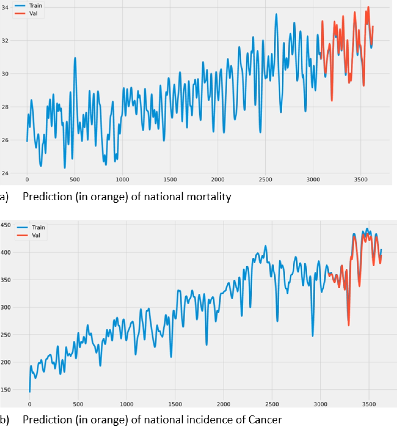
Figure 5b shows a similar prediction but in incidences of cancer in Mexico.
5 Conclusions
A repository of clean data on cancer incidence and mortality in Mexico was built over a period of ten years from sources such as the Open Data platform, INEGI, and IMSS.
The data transformation was achieved through smoothing and normalization techniques to be able to use them as input in a prediction model based on neural networks. Obtaining and predicting cancer incidence and mortality trends were validated, obtaining favorable results supported by performance evaluation metrics.
An interface was generated that allowed the visualization of the data obtained and the prediction work carried out on them. The system can be validated through the proposed metrics (MAE, RMSE) and guarantee the availability of the application to simultaneous users.

