


 nueva página del texto (beta)
 Inglés (pdf)
 Artículo en XML
 Referencias del artículo
 Enviar artículo por email
 Citado por SciELO
  Similares en
SciELO
Similares en
SciELO 
 Permalink
Introduction
Graphics are very useful tools when we want to visualize a set of data and extract information from it. Nowadays it is much easier to deal with spreadsheets, graphs and, mainly, calculations (Hibbert, 2006) than in some decades ago when it would be difficult or even impossible to perform some tasks due to limitations related to data processing. In fact, our ability to statistically analyze data has grown significantly with the maturing of computer hardware and software (Schlotter, 2013).
Data analysis should always start by (literally) looking at the data. An efficient way to do this is to use box and whiskers plot (Fig. 1) which, for short, are called box plots (Massart, Smeyers-Verbeke, Capron, & Schlesier, 2005). They were first proposed by the eminent statistician John Tukey (1977) and are powerful graphical representations of data that give an overview and a numerical summary of a data set. The graphic shows a rectangle (the box) with two lines (the whiskers) extending from opposite edges of the box and a further line in the box, crossing it parallel to the same edges. The range of the date is represented by the ends of the whiskers while the upper and lower quartiles are indicated by the edges of the box. Crossing the box there is a line marking the median of the date.
According to Larsen (1985) the construction and interpretation of these graphical formats provides considerable motivation for the "explanations" that we traditionally give for chemical and physical trends. According to him, tables of data that appear in introductory textbooks, especially alphabetically arranged data, seems rather uninformative and uninteresting, and should be accompanied by a boxplot showing the content of the table of data. He continuous emphasizing that simply seeking highs and lows and particular groupings in a table does not produce the same results and give the clues that numerical detective work of exploratory data analysis achieves and states "box-and-whiskers plots are able to be rapidly constructed and thus provide a means for quickly assessing relative data values in a large (or small) data set consisting of chemical and physical properties".
In this work boxplots are used to analyze the periodic trends of the representative elements of the periodic table. The properties considered are atomic radius (size), first ionization energy (the energy required to remove an electron from a gaseous atom), electron affinity (the energy change involved in adding an electron to a gaseous atom) and electronegativity (a measure of the tendency of an atom to attract electron in a chemical bond). These atomic properties generally vary regularly as we move across a period or up to down in a group. The knowledge of periodicity is important to understand chemical and physical properties of the elements and their compounds. Glasser (2011) believes that the importance of the periodic table of the chemical elements is that it is the principal feature related to the organization of Chemistry.
The representative elements, which are also called main-group elements, comprise both metals and nonmetals. They are found, in the long-form periodic table, in groups numbered 1, 2 and 13 through 18. The disposition of these columns is into two blocks of columns separated by the transition metals. One common aspect about the representative elements is that every element in the group has the same valence electron configuration and shows distinct and fairly regular variations in their properties with changes in atomic number. For the transition elements, the variations are not so regular because electrons are being added to an inner shell. In this discussion the noble gases were not included because they are generally not listed in electron affinity/electronegativity tables. They have no affinity for electrons since they have eight electrons in their outermost shells (except for He, which has two), as a consequence any additional electron must be added to the next higher electron shell.
The main pedagogical objective of this paper is to show how boxplots can be used in exploratory data analysis in Chemistry, particularly in making comparisons, as it is described in this example with the representative elements. The results are presented in a manner not explored in chemistry textbooks. So this work is a guide to the use of boxplots intended to teachers and advanced college students. Authors believe that this technique is important to anyone who deals with chemical information especially when analyzing data.
Methodology
Most people only think of Statistics when faced with a lot of quantitative information to process (Bruns, Scarminio, & Barrros Neto, 2006). In fact, it is not an easy task to extract information by looking so many values. A typical example where statistics is necessary is the analysis of periodic properties of chemical elements. Table 1 is a data matrix with 38 lines for chemical elements, 4 columns for their periodic properties and one column for the corresponding group in the periodic table. Values were extracted from Atkins and Jones (2009), Lee (1996) and Periodic table (2015). This matrix was the starting point to construct the boxplots. The strategy adopted in this work can be perfectly reproduced by anyone; it is only necessary software capable to construct boxplots. Authors employed Minitab 16 Statistical Software (2010), which has common statistical, plotting and modeling functions available.
Table 1 Chemical elements and the four periodic properties selected to construct the box plots.
| Element | Atomic radius (pm) | Electron affinityb (kJ mol−1) | Ionization energy (kJ mol−1) | Electronegativityc | Group |
|---|---|---|---|---|---|
| Metals | |||||
| Li | 1.82 | 59.63 | 520.22 | 0.98 | 1 |
| Na | 2.27 | 52.87 | 495.85 | 0.93 | 1 |
| K | 2.75 | 48.39 | 418.81 | 0.82 | 1 |
| Rb | 3.03 | 46.88 | 403.03 | 0.82 | 1 |
| Cs | 3.43 | 45.51 | 375.71 | 0.79 | 1 |
| Fr | 3.48 | 44.38 | 392.96 | 0.70 | 1 |
| Be | 1.53 | −66.00d | 899.51 | 1.57 | 1 |
| Mg | 1.73 | −67.00d | 737.75 | 1.31 | 2 |
| Ca | 2.31 | 2.37 | 589.83 | 1.00 | 2 |
| Sr | 2.49 | 4.63 | 549.47 | 0.95 | 2 |
| Ba | 2.68 | 13.95 | 502.85 | 0.89 | 2 |
| Ra | 2.83 | 9.65 | 509.29 | 0.90 | 2 |
| Al | 1.84 | 41.76 | 577.54 | 1.61 | 13 |
| Ga | 1.87 | 41.49 | 578.85 | 1.81 | 13 |
| In | 1.93 | 28.90 | 558.30 | 1.78 | 13 |
| Tl | 1.96 | 36.38 | 589.35 | 1.80 | 13 |
| Ge | 2.11 | 118.94 | 762.18 | 2.01 | 14 |
| Sn | 2.17 | 107.30 | 708.58 | 1.96 | 14 |
| Pb | 2.02 | 35.12 | 715.60 | 1.80 | 14 |
| Sb | 2.06 | 100.92 | 830.58 | 2.05 | 15 |
| Bi | 2.07 | 90.92 | 702.94 | 1.90 | 15 |
| Po | 1.97 | 183.30 | 811.83 | 2.00 | 16 |
| Nonmetals | |||||
| H | 1.10 | 72.77 | 1312.05 | 2.20 | 1 |
| B | 1.92 | 26.99 | 800.64 | 2.04 | 13 |
| C | 1.70 | 121.78 | 1086.45 | 2.55 | 14 |
| Si | 2.10 | 134.07 | 786.52 | 1.90 | 14 |
| N | 1.55 | −7e | 1402.33 | 3.04 | 15 |
| P | 1.80 | 72.04 | 1011.81 | 2.19 | 15 |
| As | 1.85 | 77.57 | 944.46 | 2.18 | 15 |
| O | 1.52 | 140.98 | 1313.94 | 3.44 | 16 |
| S | 1.80 | 200.41 | 999.59 | 2.58 | 16 |
| Se | 1.90 | 194.97 | 940.96 | 2.55 | 16 |
| Te | 2.06 | 190.16 | 869.29 | 2.10 | 16 |
| F | 1.47 | 328.17 | 1681.05 | 3.98 | 17 |
| Cl | 1.75 | 348.58 | 1251.19 | 3.16 | 17 |
| Br | 1.85 | 324.54 | 1139.86 | 2.96 | 17 |
| I | 1.98 | 295.15 | 1008.39 | 2.66 | 17 |
| At | 2.02 | 270.20 | 1037.00e | 2.20 | 17 |
a Extracted values from Royal Chemistry Society: Homepage (http://www.rsc.org/periodic-table/element).
b The convention adopted in this work is the same in ref. a: positive electron affinity corresponds to an exothermic process while negative electron affinity corresponds to an endothermic process.
c Pauling scale.
d Lee, J. D. Concise Inorganic Chemistry, 4th ed., Chapman & Hall, New York, USA, 1997.
e Atkins, P., Jones, L. (2009). Chemical principles: the quest for insight, 5th ed., W. H. Freeman and Company, New York, USA.
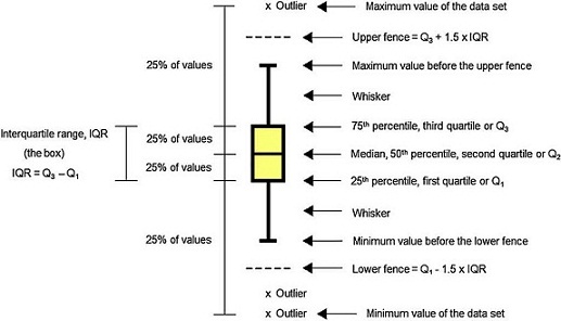
For those not familiarized with boxplots, a brief description of the main components of the graphics is done (Fig. 1).
Median
Median is a common measure of central tendency of a set of observations used in robust Statistics. So the median indicates the midpoint of the distribution. Robust Statistics are more resistant (robust) to the presence of outliers than the classical Statistics based on the normal distribution, which uses the mean as a representative measure of the central tendency (Massart et al., 2005).
The way the median is computed depends on the number of data. When this number is odd, the median is the middle observation in a ranked series of data. For example, given the following series with five ranked data: 1, 2, 4, 4, 8. The median is the third observation: 4. In case the number of data is even, the median is the mean of the two middle observations. For example, in the series: 1, 2, 4, 4, 8, 100. The median is computed as (4 + 4)/2 = 4.
The difference between median and mean as an adequate measure of robust statistics is clear when we compare them using these two examples. For the first series, the mean is computed as (1 + 2 + 4 + 4 + 8)/5 = 3.8. However, when we compute the median for the second series, (1 + 2 + 4 + 4 + 8 + 100)/6 = 19.8, it is evident that the addition of the observation 100 caused a significant increase in the mean but no change in the median
Quartile and percentile
Quartiles are values that divide up a set of ordered observations into four equal-size sets. There are three quartiles: Q 1 , Q 2 and Q 3 . Percentiles divide the total observations into 100 equal parts. Quartiles and percentiles are correspondent; the only difference is that quartiles refer to fractions and percentiles to percentages of the observations. The first quartile (Q 1 ) is the value such that 25% or 0.25 or 1/4 of the data lies at or below it. The second quartile (Q 2 ) is the value such that 50% or 0.50 or 2/4 of the data lies at or below it. The third quartile (Q 3 ) is the value such that 75% or 0.75 or 3/4 of the data lies at or below it. Consequently, Q 1 corresponds to the 25th percentile, Q 2 corresponds to the 50% percentile, and Q 3 corresponds to the 75th percentile (Mickey, Dunn, & Clark, 2004).
Interquartile range
The difference between the third and first quartile is the interquartile range (IQR), which is computed as IQR = Q 3 − Q 1 . The advantage of the IQR as a measure of variability is that it is not affected by outliers as much as the variance or standard deviation is (Mickey et al., 2004). In the boxplot, the IQR is represented by the height of the box, which starts at the first quartile (Q 1 ) and stops at the third quartile (Q 3 ). IQR comprises the middle 50% of the ranked samples and is particularly useful for comparing two data sets.
Fence
Fences are limits above and below the box of the boxplot that are used to identify possible outliers. The upper fence is the upper limit computed as Q 3 + 1.5 times IQR, so it is fixed at a value 1.5 times IQR above the top of the box. The lower fence is the lower limit computed as Q 1 − 1.5 times IQR, so it is fixed at a value 1.5 times IQR below the bottom of the box. Usually the fences are not shown in the drawing.
Massart et al. (2005) advise that, depending on the software, some boxplots may be more conservative in the sense that in addition to the extreme level as computed above, they use a second extreme level, even more distant from the box than the first one. In this work, we used the first extreme level discussed in the previous paragraph.
Whisker
Whiskers are the lines that extend from Q 1 and Q 3 , respectively, in the direction of the minimum and maximum values of the data set. Software may use three main criteria to extend the whiskers. Some of them extend the whiskers to the maximum and minimum values of the series of observations. However, some programs stop the whiskers at the fences whereas others, like Minitab 16.0, extend the whiskers to the data value just before the fences. Sometimes the whiskers are represented ending in a small horizontal line but Minitab does not show this detail in the graphic.
Data set that follows a symmetric distribution (such as normal distribution) of observable values generates boxplot with symmetric shape as the one presented in Figure 2a: the position of the line identifying the median is in the middle of the box; the whiskers have the same size in length. On the contrary, asymmetric distribution generates boxplot with the line of the median moved from the center of the box and one whisker is longer than the other, revealing the data is skewed in the direction of the longer whisker (Fig. 2b-d). Negative or left skewed distribution (Fig. 2c) is depictured by boxplot with median generally moved to the right and the right-hand whisker is shorter than the left-hand whisker. Positive or right skewed distribution (Fig. 2b and d) is depictured by boxplots with median generally moved to the left and the left-hand whisker is shorter than the right-hand whisker.

Outlier
Outlier is the value beyond the fence. There are many reasons to appear an extreme value. Sometimes outlier is a consequence of error while collecting data or while making measurements. However sometimes they are correct and just reveal how values are indeed very different from the rest of the data. Outliers may be present or not in a series of values. If present, they are signalized with a discrete symbol, such as asterisk, below the lower fence or/and above the upper fence.
After these considerations about the components of the boxplot, we call attention to the fact that there is a variety of ways to draw boxplots, none of them is standard. Software may also employ a particular mathematical method to compute quartiles and percentiles. Consequently, different drawings of boxplot may be generated from the same data set. The methodology to construct boxplot is easy. In general, a column with data is selected. Then the option to create the graphic is chosen. Detailed explanations involving mathematics and variations of boxplots are avoided, but can be found in a more specialized literature (Cox, 2009; Dawson, 2011; Larsen, 1985; Massart et al., 2005; McGill, Tukey, & Larsen, 1978; Mickey et al., 2004).
This activity has an interdisciplinary characteristic since it involves concepts from both Chemistry and Statistics according to Figure 3. The main purpose is to answer three principal questions about the representative elements when we analyze boxplots constructed based on their periodic properties.

Figure 3 Statistical and chemical concepts involved in this interdisciplinary activity. Key concept areas within the areas of Statistics and Chemistry.
Question 1. How different are metals from nonmetals?
Question 2. What is the tendency along a group?
Question 3. What is the tendency along a period?
Results and discussions
The exploratory analysis of the data set presented in this work (Table 1) can be better visualized through boxplots as already explained. Thus the visualization of the periodic trends of the chemical elements is presented in the next graphics and is discussed here.
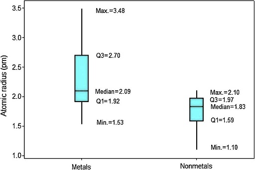
In Figure 4 the upper position of the boxplot for metals reveals they generally have larger atomic radii in comparison to nonmetals, such an evidence is also supported by the fact that median for metals (2.09 pm) is quite similar to the maximum value for nonmetals (2.10 pm). So 50% of metallic atoms are larger in size than all nonmetal atoms. Among nonmetals, values for atomic radii are distributed in a short range, while the contrary is found among metals.
Considering variations of atomic radii in groups (Fig. 5), the alkali metals and alkaline earth metals contain the elements with the largest variations. Elements that receive additional electrons in a p orbital (Groups 13-17) display on average smaller radius and variations in atomic size and are small too. It is confirmed the tendency to find larger radii as we move downwards along a group in the periodic table. But the heavier members of the group have in common atomic radius with similar sizes. Metalloids (green symbols) tend to have intermediate radii between metals (black) and nonmetals (red). Hydrogen is pointed out as having an extreme small atomic radius (1.10 pm).

Figure 5 Boxplots for atomic radius according to the groups in the periodic table. Units are in pm. Different colors for chemical elements: metals (black), metalloids (green) and nonmetals (red).
When we analyze the electron affinities, the contrary is observed. Nonmetals have generally larger values for this property (Fig. 6). Q 1 for nonmetals (73.97 kJ mol−1) is larger than Q 3 for metals (67.45 kJ mol−1). Consequently at least 75% of the atoms classified as nonmetals have stronger attractions for electron than 75% of metallic atoms. The line marking the median crosses the boxes near their center and whiskers in both sides are fairly the same size, suggesting a fairly distribution of electron affinities with symmetrical shape. In this example an outlier is pointed: polonium. This element presents an anomalous value for electron affinity (183.30 kJ mol−1) among all metals. This value is even larger than the range for all other metallic elements (−67.00 to 118.94 kJ mol−1).

The values of electron affinity usually become larger on moving across a period from left to right, but when we look at Figure 7 we see that variations for electron affinities in groups are rather irregular. The elements in Groups 2 and 15 appear not to follow the general trend since the added electron would start a p orbital or would be paired with another electron in the p orbital, respectively (McMurry & Fay, 2003; Zumdahl & Zumdahl, 2007). Groups 1 and 13 display short range and most of the boxes exhibit the line marking the media settled in the upper part of the box, indicating that 50% of the elements in the group with the strongest attraction for electrons exhibit small variations in values for electron affinities. Electron affinities for metalloids (green symbols) have fairly intermediate values between those for metals (black) and nonmetals (red).

Figure 7 Boxplots for electron affinity of atoms according to the groups in the periodic table. Units are in kJmol−1. Different colors for chemical elements: metals (black), metalloids (green) and nonmetals (red).
Results for ionization energy are rather similar to those for electron affinity. Nonmetals also have generally larger values (Fig. 8). Q 1 for nonmetals (941.84 kJ mol−1) is far larger the maximum value for metals (899.51 kJ mol−1). Thus now at least 75% of the atoms classified as nonmetals have larger ionization energies than all metallic atoms. Moreover, the line marking the median crosses the boxes toward Q 1 indicating a distribution with asymmetrical shape.

Ionization energies exhibit a regular increase when we move from left to right through the groups despite two principal irregularities occur (Fig. 9). One of them involves Group 13 because the 2p electrons are slightly higher in energy than the 2s electrons (the group before, Group 2). Then less energy is required to remove electron in 2p orbital, consequently the ionization energy in Group 13 does not follow a tendency to increase. The same dip is found in Group 16 but the explanation for this behavior is the fourth p electron in this group, which is paired with another electron in the same orbital, so it experiences greater repulsion than it would in an orbital by itself. This increased repulsion makes it easier to remove the p fourth electron in an outer shell for Group 16 than the third p electron in an outer shell for Group 15. Other observation is the significant difference in ionization energies involving the elements in the second period (B, C, N, P and F) from those of other elements in their families, because second-period elements have no low-energy d orbitals. Going from groups 13 to 15, electrons are going singly into separate p orbitals, where they do not shield one another significantly.

Figure 9 Boxplots for ionization energy of atoms according to the groups in the periodic table. Units are in kJmol−1. Different colors for chemical elements: metals (black), metalloids (green) and nonmetals (red).
Hydrogen is marked as an outlier among elements in Group 1. The exceedingly high ionization energy for this atom is a direct consequence of its small size (atomic radius 1.10 pm). Ionization energies increase down to up through the Groups even though some exceptions are observed. Clearly we observe that metalloids (green symbols) exhibit intermediate values for electron affinities between those for metals (black) and nonmetals (red).
The last periodic property investigated is electronegativity. The position of the boxplots for metals and nonmetals differ greatly with respect to the electronegativities (Fig. 10), whose values tend to be larger for nonmetals. Q 1 for nonmetals (2.18) is larger than the maximum value for metals (2.05). Then at least 75% of the atoms classified as nonmetals have stronger power to attract electrons to itself when in chemical combination than all metallic atoms. The line marking the median crosses the boxes near the center. However, distribution is only somewhat symmetrical for metals; nonmetals show whiskers with different size, revealing a rather asymmetrical distribution.

Electronegativity displays a regular increase when we move from left to right across the periodic table (Fig. 11). The same way as occurred with ionization energy, hydrogen is marked as an outlier among elements in Group 1. Electronegativity tends to increase down to up through the Groups even though some exceptions are observed in this case too. Values of electronegativities for metalloids (green symbols) are intermediate between those for metals (black) and nonmetals (red).
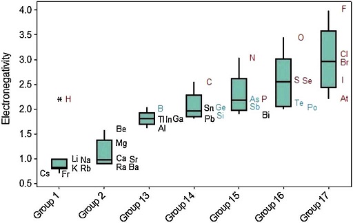
Figure 11 Schematic boxplots for electronegativity of atoms according to the groups in the periodic table. Units are in Pauling scale. Different colors for chemical elements: metals (black), metalloids (green) and nonmetals (red).
This article described the use of boxplots to analyze the periodic trends of the representative elements. A similar study was presented in this journal (Ferreira, Da Costa, De Miranda, & Figueiredo, 2015) using the k nearest neighbor (k -NN) method to classify the representative elements as metal or nonmetal according to their atomic radius, first ionization energy, electron affinity and electronegativity. Now we can have a better idea about how this classification is related to these properties. Boxplots show a rather distinct distribution of values for both classes, which support this distinction in behavior and classification. Moreover, metalloids are located in boxplots in a region intermediate between metals and nonmetals, which allowed for the misclassifications verified when using the k -NN method. This region is not clearly defined since some irregularities occur along the groups and across the periods, something observed even when we analyze metals and nonmetals separately. Authors agree with Rich and Laing (2011) when they state that "nature is clever in that no single and simple periodic chart reveal all of the important relationships among the chemical elements". So we presented in this article an alternative way of visualizing these relationships through boxplots.
Conclusion
Application of boxplots to investigate the periodic properties of chemical elements showed similarities, differences, trends and irregularities among elements, groups and periods, which help better understand their characteristics. In addition, they pointed out that metals, nonmetals and metalloids display a somewhat distinct range for atomic radius, first ionization energy, electron affinity and electronegativity. Finally, authors want with this article to call attention to the advantages of the application of boxplots in data analysis of chemical interest. These pictorial representations are easy to be constructed and interpreted and, the most important, can be very useful to uncover chemical information hidden.

